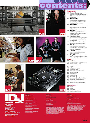
Here i am going to analyse the contents page of another well known magazine, iDJ, otherwise known as International DJ.
The images are the first thing what catches the audiences attention, a cluster of images have been placed on the left hand side due to people reading from left to right, and also people usually look at images before reading the pieces of text. If the images interest the audience, it will encourage them to read through the text, and lots of images have been placed on this page so it encourages the readers to read through the whole magazine. The splash of the magazine has been layed out differently to the other magazines i have analysed, for example the previous magazine have both had the contents placed down the left hand side, where as this magazine doesn't, making is unique to others. The settings and images represented to the audience in the images relate to the magazine genre, which is what should always be done because the magazine has been made for those who want to read that particular genre so if the images contain representations of different genres it will discourage the audience from reading it. Placed on top of the images are the page numbers where the articles are placed within the magazine, the page numbers have significantly been separated from the images by being put in a block of a contrasting colour, with white coloured numbers placed on top. This particular scheme is carried on throughout the whole contents page, for example, on the banner at the bottom. Within the banner is the much needed information for the reader in case they feel the need to contact the magazine, which is contact details and who wrote what in the magazine. The banner is separated from the rest of the magazine because of the boldness of the colour, but it still fits in the the rest of the contents page. The text on the contents page differentiates from the whole of the contents page because no pink is within it like the rest of the features on the magazine, instead they have used boldness of text to separate the subtitles from the description of the articles.
The contents page itselfs looks very sophiscated and professional, this may be due to the magazine being of a higher cost than the average magazine. The magazine costs around £4, which is expensive, especially to those with a low economic spending power.
Judging from the contents page, it is assumed that the target audience are those of a high economic spending power, because of the price, of an age between 18-30, those of both genders, and who take an interest in the music presented within the magazine.
Overall, the contents page has been presented to suit it's target audience and their style, whilst still looking professional. More variation of colour could have been used to attract attention to certain articles and they could have used images which had more of a meaning to them.
Subscribe to:
Post Comments (Atom)

No comments:
Post a Comment