Thursday 16 December 2010

Q Double Page Spread Research (2)


Here I am going to analyse a double page spread from the magazine 'Q', analysing double page spreads such as this one will help me with the making of my own double page spread and allow me to gain various ideas on what I want to contain on my double page spread.

This double page spreads differentiates from other double page spreads because the main image takes up the whole of the page, and the text is then placed on top in a contrasting colour to the background, whilst also managing to stick with a particular colour scheme. Through research, it has been found that it is very common for Q to use the text placed on to of full image for their double page spreads and the majority found did have a full image with the article text placed on top in the contrasting colour.

The main image has been taken in medium shot, and the mise-en-scene is a prison line-up, creating a certain image of the characters, which is making them look rebellious. The characters in the shot look arrogant and stuck up, which allows the setting and their selves to come together to create a whole representation of the band. The photograph has been taken as the band members are revealing themselves in a mid action shot, suggesting that they have a dark side to them. The main headline for the page has been put in the same colour as the whole article, which doesn't separate the text from the headline much, but they've used font size as a different technique. 'New to Q' is headline placed at the top of the left page, and is also a regular feature, it is coloured red, which is the typical well known colour for Q.

The institution for Q is 'EMAP' and is a large global company which also institutes a large number of other magazines, giving Q a reliable institution that is beneficial for them. 

The ideology for the magazine has again been presented, like other magazines, to inspire their target audience to be like the band members. They're dressed in a particular way to make the readers aware of their dress sense so that they think it's cool and start dressing like that too, creating a stereotype of people like this. The whole idea of rebellion in the image is given off because of the mise-en-scene and attitudes of the characters, and this reflects their genre music to make it seem as though everyone who produces or listens to that music genre is like the stereotype associated with it.

The target audience for this magazine would be those interested in the genre of music presented throughout the whole magazine, and in this case it is alternative music. The majority of the readers would have to enjoy the music discussed in the magazine to be interested in what's in the magazine.

Overall, the various techniques and features in the magazine create a certain image of the band, which is then passed on the the audience in an effective way. Like most other double page spreads, other colours could have been added to the page to make certain features stand out, but because of the background being the main image, it would have been tricky to have tied in the different colours so that it suited the theme of the page.

NME Double Page Spread Research


This is a double page spread for the magazine 'NME,' which are a very popular music magazine produced weekly in the UK.

The first thing which stands out to a reader of the magazine would be the main image, which is placed on the left hand side, placed on top of the page is a main headline quoting 'The Chapman Family.' The characters on the image have been presented to look like a stereotypical family, hence the main headline saying 'The Chapman Family', but with a difference, there is no variation in ages. The setting of the main image seems to be in a typical family home, but there is a lot more members than the average family, also the variation of ages which makes it unique compared to a stereotypical family.

The text from the double page spread has been placed on the right hand side, and has been laid out very traditionally and there is nothing fancy about the layout of it. Like the majority of magazines, there has been a quote placed randomly in the middle of the text, this is to create encouragement for the reader to read the full article and not just look at the images. The main image has been placed on the right hand side and is the first place where the reader will look before reading the article itself. The image seems to follow a particular theme, which allows the text to tie in with it. The text doesn't look like it's purposely been placed their giving off the impression that it's part of the image and not a separate feature. The main image also looks like the setting hasn't been purposely created for the image and it looks as though it's just been taken in the spare of the moment.  Above the main image is a brief description of the article, which the reader would usually read first, and has been written to again encourage them to carry on reading throughout the article.

The language presented in the double page spread makes the characters in the main image look inspirational, and allow the audience to want to be like them. The camera angle used by the photographer is a group medium long shot, which has been used so that all the characters could be included in the shot and also so that the scene could be included.

Throughout the page, a colour scheme has been created, which contains a couple of colours and allows the page to look professional rather than containing alot of various colours, which would make the page look very unprofessional and as though it had been created by a child.

The target audience for this double page spread would be those interested in similiar music to what the characters would listen to and those who would have similiar interest as the characters in the main image. This is because the characters have been presented as aspirational, which encourages the audience to want to be like them.

Representations have been created in the double page spread to reflect the target audience, for example the style of the characters in the main image and their taste in music. The representations will also influence the audience on things such as what they listen to, what they dress like etc.

Overall, the double page spread is very plain and the only feature which attracts the audience to them is the main image, which is what most double page spreads do anyway. A wider variation of colours could have possibly been used to attract attention to other certain features but the page seems very limited on what it contains image wise.

Wednesday 15 December 2010

iDJ Contents Page Research (3)

Here i am going to analyse the contents page of another well known magazine, iDJ, otherwise known as International DJ.

The images are the first thing what catches the audiences attention, a cluster of images have been placed on the left hand side due to people reading from left to right, and also people usually look at images before reading the pieces of text. If the images interest the audience, it will encourage them to read through the text, and lots of images have been placed on this page so it encourages the readers to read through the whole magazine. The splash of the magazine has been layed out differently to the other magazines i have analysed, for example the previous magazine have both had the contents placed down the left hand side, where as this magazine doesn't, making is unique to others. The settings and images represented to the audience in the images relate to the magazine genre, which is what should always be done because the magazine has been made for those who want to read that particular genre so if the images contain representations of different genres it will discourage the audience from reading it. Placed on top of the images are the page numbers where the articles are placed within the magazine, the page numbers have significantly been separated from the images by being put in a block of a contrasting colour, with white coloured numbers placed on top. This particular scheme is carried on throughout the whole contents page, for example, on the banner at the bottom. Within the banner is the much needed information for the reader in case they feel the need to contact the magazine, which is contact details and who wrote what in the magazine. The banner is separated from the rest of the magazine because of the boldness of the colour, but it still fits in the the rest of the contents page. The text on the contents page differentiates from the whole of the contents page because no pink is within it like the rest of the features on the magazine, instead they have used boldness of text to separate the subtitles from the description of the articles.

The contents page itselfs looks very sophiscated and professional, this may be due to the magazine being of a higher cost than the average magazine. The magazine costs around £4, which is expensive, especially to those with a low economic spending power.

Judging from the contents page, it is assumed that the target audience are those of a high economic spending power, because of the price, of an age between 18-30, those of both genders, and who take an interest in the music presented within the magazine.

Overall, the contents page has been presented to suit it's target audience and their style, whilst still looking professional. More variation of colour could have been used to attract attention to certain articles and they could have used images which had more of a meaning to them.

Wednesday 8 December 2010

iDJ Magazine Cover Research (3)


Here i am analysing the magazine cover of iDJ, i have chose to analyse this magazine because it contrasts with my research from other magazine due to their genres.

The first thing on this front cover which attracts attention to the audience would be the masthead and main cover line. Although for most magazine, the masthead is the first thing which is looked at, but the main cover line attracts just as much attention. The selling line is placed below the mast head, which is a short description of the masthead. The font colour of he mast head is white, making it contrast with the background, which is coloured black. The main cover line ties in the the background because the font is the same as the lighting in the background. The background suggests the models are at a rave, which are very common social places for people who enjoy the genre of music in this magazine. Only the silhouettes of the models are visible on the main image, this may be because of the setting which they want to be represented to the audience. The selling line beneath the main cover line is encouraging the reader to buy the magazine because it insinuates that the information which is included within the magazine can't be read in any other magazines but this one. The other selling lines beneath the main cover line follow a particular colour scheme which seperates subtitles from following information which encourages the reader to read on. A banner is placed at the top of the magazine, which is again is encouraging the reader to buy the magazine to think that they're going to win something from buying the magazine. The banner has been made to stand out from other selling lines because it has a burgandy background, which has only been placed once more at the bottom of the magazine, so it has been seperated from all other information. At the bottom of the magazine is the second banner, which contains a piece of text saying 'The DJ & Dance Producer's Bible' which insinuates that you only really read the magazine if you're really into this genre of music, due to it being referred to as a 'bible'.

The main image for the cover has been created to catch the audiences attentions and to inspire them, for example, the rave scene in this image will encourage readers to attend particular events like these, and the main image refers to the genre of music presented in the magazine. All of the various selling lines on the cover have been placed around the image, so that all the attention is attracted to the main image, except the main selling line quoting 'orbital' which is placed almost on top of the image because its been made to look like it's part of the image itself. The whole settings of the image on the front cover also allows the audience to feel part of it because of the eye contact the characters are giving, although this is not obvious, you can tell that they're looking at the reader.

The magazine has been presented to suit their ideal target audience, and in iDJ's case, their target audience is based on the music genre, which is dance/electro, which also again explains the setting of the main image. The various selling lines also suit the target audience because of the types of events and DJ's mentioned on them. The magazine has targeted those of a high economic spending power due to the price of the magazine being almost £4. Although this is a monthly issued magazine, it is still high in price for those of a lower or working class, who may not be able to afford this. The social classes relate to the events which are presented in the magazine because the events are mostly expensive ones, which only those of a higher class would be able to afford.

Overall, the magazine cover has used affective ways to allow the opinions to be made by the audience and also to reflect the genre of music. The producers has used certain techniques which make the main image seem very realistic and give the audience a real feel of what it is like to like that genre of music and the things that are involved with the liking of the genre of music.

Wednesday 24 November 2010

Q Contents Page Research (2)


Here i am going to analyse my second contents page for my research on music magazines.

The main outstanding features of this contents page is the main presented image of a recent band 'The Courteeners' and the masthead. The masthead is placed at the very top of the page and is a completely different colour to the rest of the page which sections it off from all the information, allowing it to stand out. The main image is an aspirational image for the audience, and the camera angle which has been used is a medium long shot, which allows the reader to see all of the band members and not just a section of them, it also allows the reader get a clear idea of what through their appearance. The page carries a particular colour scheme throughout it, which is the commonly used through all of the 'Q' magazines, which is white, red and black, the black usually being used as a background for the writing so it stands out to the reader. Placed down the left hand side of the page is the contents, which includes features, a special, and monthly regulars. The contents have been placed down the left hand side because this is the first place where you look when reading due to reading from left to right. The main subtitles for the contents are in a larger font, with a red background, so that you can tell what parts of the text are the titles. The 'Special' subtitle in the contents information is in a gold coloured font, the colour gold is associated with wealth and good quality, which is why it has been used for a special part of the magazine, to symbolise the good quality of the information within the special articles. The layout of the contents page is very simple and is the same as the majority of the other contents pages published by 'Q', they have done this so that those who read the magazine are familiar with the layout and can get straight onto reading what they want to know rather than having to familiarise their selves with the layout of the page.

  The target audience for this magazine would be generall students, younger people around the ages of 18-30 who like the music which is within the magazine. Generally, magazines of this price would be aimed at those of a middle/higher class because people who have a high economic spending power have the spare money which can be spent on luxury items such as magazine containing quality music, just like this magazine. The magazine also looks very sophiscated which reflects the target audience again because of how much they have spent on the magazine, they expect the audience to also be sophiscated so the style has been created to benefit and reflect the target audience.  The main image represents the genre because of the bands indie style, and they would be expected to producing music of a similiar genre which ties the two together. No editorial is contained within the contents page, which could suggest it is on a different page to show the importance and again quality of the written articles.

Overall, the contents page all fits together and represents it's target audience, but more colours could have been added to brighten up the page or certain techiniques could have been used to make particular things on the page stand out.

Tuesday 23 November 2010

Q Magazine Front Cover Research (2)


This magazine cover is known as 'Q magazine' and is very popular in the magazine industry which is published monthly. Q was first published in October 1986 and from then on has been very successful UK magazine.

The first thing which you instantly notice about the magazine is it's main image, placed directly in the centre of the cover with the main text wrapped around it. The image is of a celebrity, Lady Gaga, who has only recently just achieved fame, which is what the main subtitles points out. Reading 'Move Over, Madonna....LADY GAGA Has RISEN! informing the reader of a new music star, and the text insinuates that Lady Gaga will be better than Madonna, which will encourage people to read the article due to Madonna being a very successful and popular artist. The image portrays Lady Gaga as a younger version of Madonna and is comparing the two together, and as a result Lady Gaga becomes known as the 'one to be' or an inspiration to the readers. Below that piece of text it reads 'PLUS' and a list of other artist included within the magazine which again will leave the reader intrigued and will want to read the magazine to find out what the magazine says about the artists. Also down the whole of the right hand side are other pieces of text which have been made to encourage people to read the magazine, for example, it says '100 Most Shocking Moments In Music' and as a reader they would be unaware of the moments and will want to read the article out of curiosity. The main colour of the back ground is a very light grey colour, but it works well with the rest of the magazine because all of the text it either black or red, setting a coloured theme on the magazine. The layout of the magazine is very clustered, but this is a good thing because it makes it seem as though the magazine contains a lot of information which people want to know.

The camera has been placed at eye-level angle to try and create a sense of communicaton between the reader and the character, which will catch the readers attention when looking which magazine to buy. The shot which has been used in the main image is a mid shot, and allows the reader to see the whole of the characters body so they become aware of her personality, which is reflected in her attitude and style.

Q's institution which they rely on to publish their magazine is called 'BAUER.' Like many other instititutions , this is a very large business who is relied on by many other companies other than Q.  Bauer is Europes largest privately owned publishing group, which again allows the NME producers to be able to rely on them.

The ideology in this magazine has been used to inspire the readers to encourage them to listen to that specific genre of music which is presented on the magazine cover, and in this case it is pop/dance. Usually music of a similiar genre are presented on a front cover, but in this case, a range of genres are presented, for example lady gaga is a very contrasting genre compared to Jimi Hendrix and The Who. Q is a fairly expensive magazine, which is why it features quality music and the quality of the magazine is good in general, which will target a specific social class as to who buys the magazine, for example, the magazine costs around £4 which only certain people will be able to spend on a magazine compared to other magazines which are selling for around £2 which will attract the lower class people to buy. The people who are most likely to buy Q are those of a higher age due to the price and genre of music featured within the magazine. People in their mid 30's are likely to spend alot of money on a magazine due to having their own job etc but if they're aiming their magazine at the older audience, it will require them to contain particular music which suits them too.

The representations created in this magazine refer again to the target audience and what will inspire them, due to Lady Gaga being the main image of this issue, men are likely to buy it because of the half naked woman on the front and not because of the music within it, so this specific issue targets men because of the main image. The magazine represents Lady Gaga as a very succesful artist because the magazine claims and insinuates she is the 'new Madonna'.

Overall, the various conventions and representations on the magazine cover create a specific theme which targets the audience intended for the magazine. The produced has been very succesful inc creating the magazine to reflect different genres of music. Although the magazine follows a specific colour theme, i think that more vibrant colours could have possibly been used to make the magazine stand out more.

Thursday 11 November 2010

NME Contents Page Research


Here i am going to analysis the contents page of the magazine 'NME.'

The first thing in this contents page what gets my attentions is the masthead, main sub title and main image. The masthead stands out mainly because of it's font size, which is the largest presented on the page, the producer will have done this to inform the reader that it is a weekly issue due to it saying 'THIS WEEK.'  Placed underneath the masthead is a very small banner stating the date of the issue and is therefor an informative piece of text. Another main section of the page is the editorial, which is placed directly in the middle of the page and contains large/bold fonts and images to attract attention. Beneath the editorial is a small advertisement benefiting the magazine because the magazine are advertising their self for subscriptions and claiming you save 33% which could result in more purchases of the magazine. Down the left hand side of the page is a 'band index' which makes the magazine unique because not many other magazine contain this kind of information, the background of the section is red, and the text has been highlighted white, to allow it to stand out from the background. Placed beside the band names is then a page number in a different colour to everything on the page so that the numbers are separated from the text to make it clear to the reader. Down the right hand side of the page is all the other necessary information which is needed for the readers, to allow them to know where everything is within the magazine. The subtitles for this section are separated from the informative text below it by the font and background, for example the subtitles are colour white on a black background, then beneath them is just a plain black coloured font stating the necessary information.

The camera angles which have been used for the images make it seem as thought you're part of the audience, watching the performers onstage which give a very realistic feel to the magazine. The contents page of this magazine cover seems to have a colour scheme, which is red and white, commonly used by NME. The layout makes it easy for the readers to navigate the page without becoming confused.

NME Magazine Cover Research


This is a music magazine cover, known as NME, which stands for New Musical Express. I am going to analyse this magazine cover, and state the conventions and look at the things which make up the magazine so it suits it's audience.

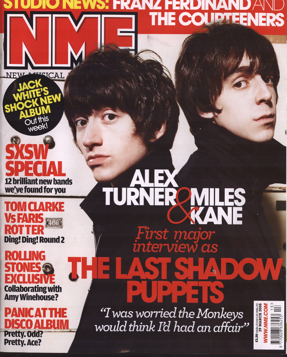
The first thing which stands out on this magazine cover is the main image, which is the band members of 'The Last Shadow Puppets,' which are presented as very sophisticated men. They are both wearing black coats, and have very pale faces, which makes their faces stand out to the audience. Overlapping the image is the main piece of text on the front cover. There is 3 different parts to the text, the first one states the band members names, and is presented in two different colours which are red and white. Red is one of the main colours commonly used in the NME magazine which is a factor as to how people recognise the magazine and know it is the NME magazine. The names are placed directly underneath the band members in the correct order allowing the audience to know who is who in the image.  The second piece of the text is the band name which is put in a slightly larger font than the rest of the piece of text so that it stands out to the audience and is in a red font to stand out from the image which it is placed on top of. The third piece is then written in italics and a white font which separates it from the rest of the piece of text and is part which encourages the reader read the article. The camera angle used is medium close up and the characters have been made to look like they are looking directly at the audience which will grab their attention when looking at which magazine to buy. Usually NME have a consistent look and style to all their magazine, and they do this by placing their main cover line in the centre of the magazine and their masthead is always placed in the top left hand corner, because this is the first place the audience will look when reading the front cover.

All of the sub headlines in the magazine are placed down the left hand side, which benefits the magazine because it's the first place as to where the audience will look and also when the magazines are stacked they are placed so that is the only part of the magazine visible. If the sub headlines are on show and look interesting, more people will want to read the magazine. The sub headlines don't vary in colour very much, but enough to make it clear that they are all on different subjects. The only colours used at black and red, which are common colours in NME magazines and allow the text to stand out from the pale white coloured background.

A puff is used in the magazine, and a generally used at least once in all NME magazine covers. The puff in this magazine is black in colour, and again has been made to stand out from the background of the magazine which is a very simple colour and has been made that colour so that the texts could be made to stand out. The puff is stating 'JACK WHITE'S SHOCK NEW ALBUM Out this week!' which is giving the reader information that a new must have album is out this week.

At the top of the magazine is a banner, which is used to present more information which is included within the magazine. Again, it's main colour is red, which is the colour of the background of the banner, and the font is coloured yellow and white, which follows the style of the rest of the magazine and is the commonly the default colour scheme in magazine designs.

Many various different languages are used in the magazine so it attracts the magazines target audience, for example the style of the magazine cover. It's style is very individual and has been created to suit the music genre presented in the magazine. The camera angle which has been used for the front cover image is medium close up and the band members have been made to look at the camera which will attracts buyers attentions and therefor lure them into buying the magazine. The main colours in the magazine are red and white, as mentioned before, these have been used to allow the text to stand out from the rest of the front cover. The layout of the magazine had been made to look very full and clustered, making it look as though the magazine contains a lot of information which will again lure the audience into considering to buy the magazine if they think it contains a lot of information which they want to know. The main characters in the image are presented quite confident, just like the rest of the characters in the NME magazine issues, which is usually done to reflect the target audience or to inspire them.

The institution's which created and publish the magazine covers are very large businesses. The institution's are chose as to which one suits the magazine best, and in NME's case they chose IPC, which is the UK's leading consumer magazine publisher, which suggest it's a successful business which the magazine are able to rely on.

The ideology of this magazine has been presented to inspire the target audience by the type of people which are presented on the front of the magazine as well as the genre of music. The chosen music genre for this magazine is indie, and you can tell this just by looking at the front cover because of the way the band members look and also because of the music which is mentioned in the magazine.

The target audience for this magazine is people between the ages 16 to late 30's depending on the audience's music choice. But the audience would have to like indie music in order to enjoy reading the magazine. The magazine is mainly aimed at those of a working or lower class, mainly due to the fact the magazine is very low in price and the music is as good at those in the more expensive magazine such as Q. The magazine also doesn't look very sophisticated like the more expensive ones would, but this look is generally the one which the NME producers are aiming for.

The representations made in the magazine are very positive, and in all the sub headlines they mainly aim to have a positive benefit on the audience and what they want to know and have purely been written for the audiences' entertainment. The images and text all represent the magazines target audience because of it's style.

Overall, the magazine has been produced in a very good way to represent it's target audience and contain all the informaiton on the front cover which would encourage people to read it, and this is usually one of the main aims of a magazine producer.

Wednesday 3 November 2010

LIIAR in music magazine covers

Language-various different camera angles used to represent certain things, colour codes used usually have a meaning for why they have been used, and the layout of the magazine cover gives off a certain idea to the audience.

Institution-Publisher publish the magazines and are usually picked to suit the magazine and it's target audience in the best way possible.

Ideology-Values, morals and messages expressed. Most magazine aim to aspire people, to make them want to be like those featured in the magazine. Magazines sold at different prices to meet peoples' requirements, cheaper magazines have less quality, which is why they're cheaper, and are mostly bought by people of a lower or middle class and students. The more expensive magazines contain more famous people, and are often targeted at those of a higher class, usually those with more money.

Audience-Magazines are usually produced to meet the needs of the target audience, those of a specific age, social class or 'type.' Often based up the buyers profession and their economic spending power, those of a higher wealth are more likely to buy the more higher priced magazine of a better quality, compared to those of a lower wealth who may only be able to afford the lower priced magazines with a lack of quality that doesn't meet their standards.

Representation-Representations often made in the magazine are contained within the magazine and the things used within it, for example the genre of music, or the type of people.

Brief for Music Magazine Cover

For my media coursework, I have been asked to produce a front cover, contents page and double page spread for a music magazine, along with the necessary research and planning which is relevant to my work. I am using the website 'blogger.com' to present my work, because it is a good way of uploading my work instantly.

Thursday 14 October 2010

What LIIAR is.

LANGUAGE
How the magazine is made into language, for example how the mastheads or subtitles are used. The language for the magazine will vary on who it is aimed at for example if it is aimed at the teachers the text will be more formal than the text that would be used if it was for the students.

INSTITUTIONS
Who produced the text, and does it matter who produced it? Does who produced it effect the quality of the text?

IDEOLOGY
What ideas does the magazine give off? What values, norms and morals are used? What are the initial ideas of the magazine?

AUDIENCE
Who is the magazine aimed at? There is not a single meaning there is a range of possibilities which are defined by both the text and the audience. Being that this is for a college magazine it will purely be aimed at teachers and students of all ages and genders.

REPRESENTATION
Is the magazine represented in a negative or postive way? What makes it negative or positive? Locations/Religion/Gender/Stereotypes? Referring to the aspects of 'reality' such as people. places, objects etc. However it depends on what the magazine is about and in this case it is about college and so for it to appeal to its' target audience it will be positive showing both the teachers and students as hard working.

Thursday 7 October 2010

AS Media Studies Brief and Preliminary task

Preliminary exercise:
using DTP and an image manipulation program, produce the fton page of a new school/college magazine, featuring a photograph of a student in medium close-up plus some appropriately laid-out text and a masthead. Additonally you must produce a mock-up of the layout of the contents page to demonstrate their grasp of DTP.

Main task:
the front page, contents, and double page spread of a new music magazine. All images and text used must be orginal, produced by you-minimum of four images.